Summary
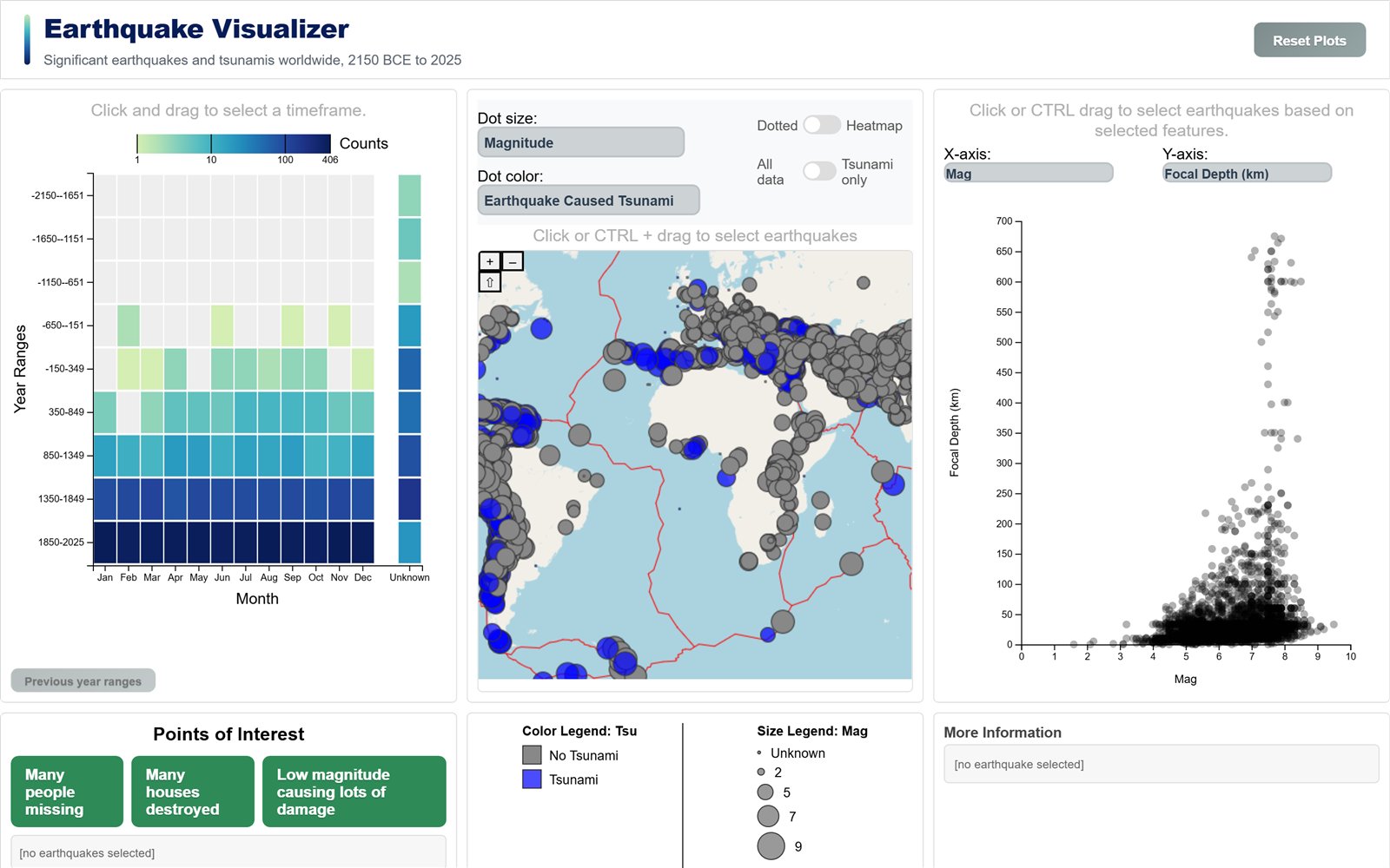
- An interactive web visualisation of 6,393 significant earthquakes and 2,512 tsunamis, from ancient records to 2025, built as a group project with D3, OpenLayers and Vite.
- A world map, a timeline, a scatterplot and a detail view are coordinated through linked brushing, so a selection in any view filters the other three.
- My part was the timeline: a brushable heatmap grid of year ranges against months with adaptive binning, drill-down navigation and a log-scaled sequential colour encoding.
- The records were converted from tab-separated exports to GeoJSON in Python, and the site is deployed to GitHub Pages through continuous deployment.
Overview
An interactive visualisation of 6,393 significant earthquakes and 2,512 tsunamis, from ancient records to 2025, built with D3 for the timeline, scatterplot and detail view, OpenLayers for the map and heatmap, and Vite for builds. Four coordinated views use linked brushing: a selection in any view filters the other three. The design goal is to let a user move between where, when and how severe: find a cluster on the map, see when it happened, compare its magnitude and impact with the rest of the record, and read the full entry for a single event.
Data
The earthquake and tsunami records were exported as tab-separated files and converted to GeoJSON in Python. Every row with valid coordinates becomes a point feature, and all non-empty fields are kept as properties, so missing values are absent rather than encoded as zeros. Tectonic plate boundaries are loaded as a third GeoJSON layer. The attributes cover location, date and time, magnitude, focal depth, Modified Mercalli Intensity, and impact measures such as deaths, injuries, damage and houses destroyed or damaged, many with a recorded category that stands in where the exact figure is missing. Earthquakes and tsunamis are linked through a tsunami identifier on the earthquake record.
Linked views architecture
All three datasets are loaded once at start-up and held in memory, and every view works on GeoJSON features directly, so a selection is simply a subset of the same feature objects and needs no conversion between views. Each view exposes a draw and an update operation. A selection in one view passes the selected records to the update of the others, and each applies them in its own way:
| Receiving view | What it does with a selection |
|---|---|
| World map | Shows only the selected earthquakes, in both the point and the heatmap layer. |
| Scatterplot | Keeps every earthquake as context and draws the selection on top. |
| Timeline | Rebuilds its grid from the selection, adapting its year ranges to the selection's span. |
| Detail view | Shows the full record of the first selected earthquake. |
The receiving behaviours differ by view. The map filters to the selection. The scatterplot keeps the full distribution in the background, since a selected point is read relative to all others. The timeline re-bins, since a selection often covers a much shorter span than the full record. Two global controls act on all four views at once: a reset, and a tsunami-only filter that restricts every view to earthquakes that caused a tsunami.
View 1 · my part
Timeline
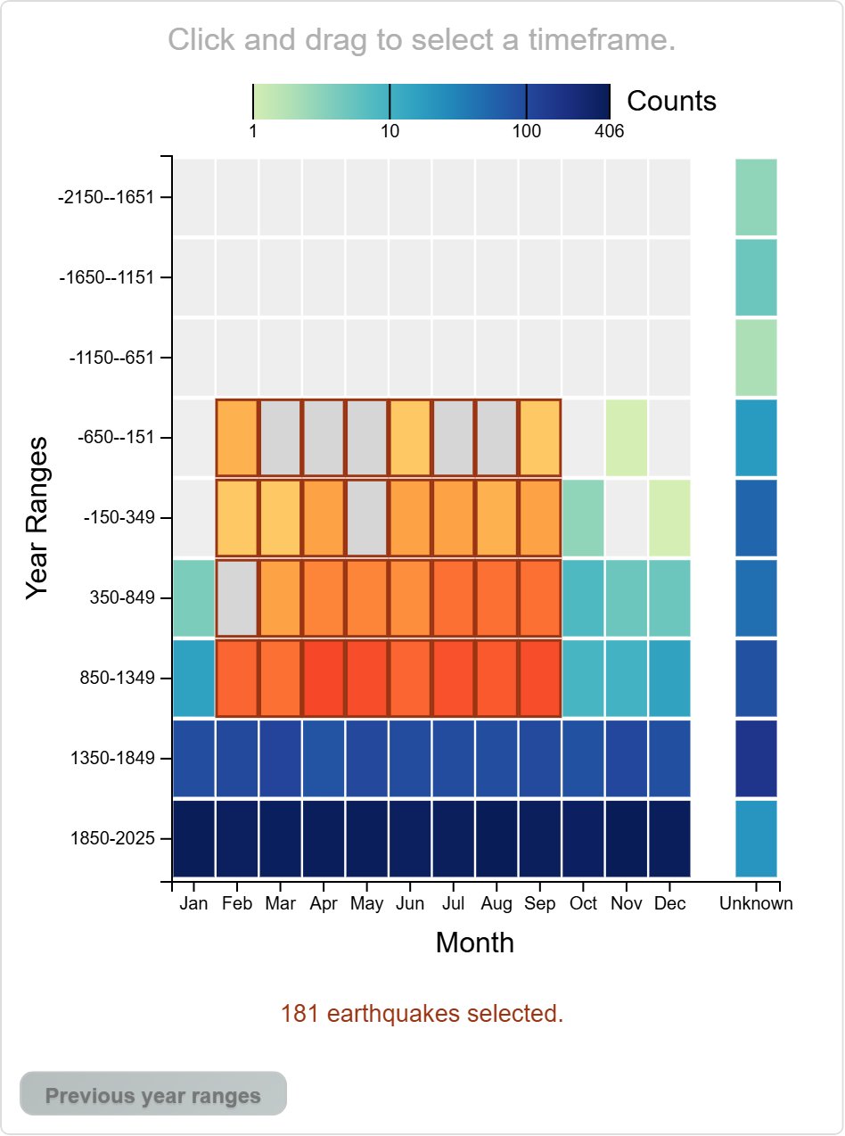
The records span several thousand years and are very unevenly distributed, so a histogram over time does not work. I built the timeline as a heatmap grid of year ranges against months, with adaptive binning: range width follows the span of the data shown, 500 years for spans over 500 years, then centuries, decades and single years once the span is ten years or less. Counts are aggregated per year and month and then summed per range, so each cell holds the number of events in one month column of one year range.
- Brushing a block of cells selects a timeframe and filters the other views. The brush is resolved into the year ranges and months it overlaps, so a selection always follows the grid. Selected cells are outlined, which keeps a selection visible over empty cells, and a status line reports the selection size. An empty selection says so and resets the other views.
- Clicking a year range drills down into finer ranges. Navigation keeps a stack of zoom levels: only drilling down adds a level and only the back button removes one, while a selection from another view starts a new stack.
- Records without a month (402, mostly historical) get their own selectable Unknown column, set slightly apart from the months.
- Cell colour uses a log-scaled sequential encoding on a multi-hue palette, so sparse ranges stay visible next to dense ones. Empty cells stay neutral grey, and selections switch to a contrasting palette. A legend with ticks at powers of ten shows the scale.
View 2
World map
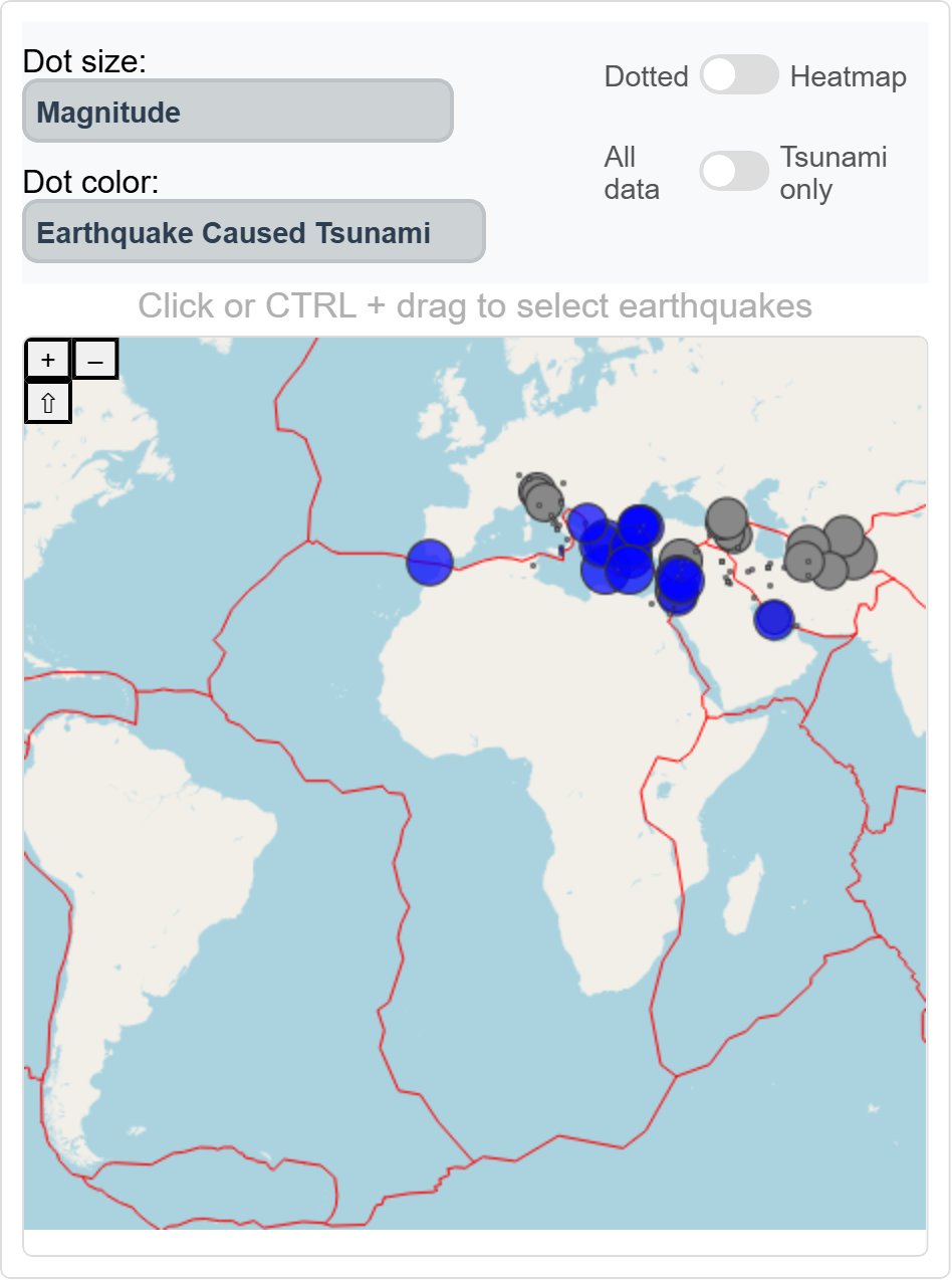
An OpenLayers map stacks an OpenStreetMap base layer, tectonic plate boundaries, a heatmap layer and the earthquake points. Dot size and colour can encode magnitude, focal depth, intensity or impact measures, with linear scales for magnitude and intensity and logarithmic scales for depth and impact. Colour can also show the country or whether an earthquake caused a tsunami.
- A switch replaces the points with a magnitude-weighted heatmap. Another filters to tsunami-causing earthquakes. Weights are scaled down so that dense regions do not saturate.
- Click and box selection, including boxes across the 180th meridian, feed the linked views.
- Here the map shows only the earthquakes from the timeline selection above.
View 3
Scatterplot
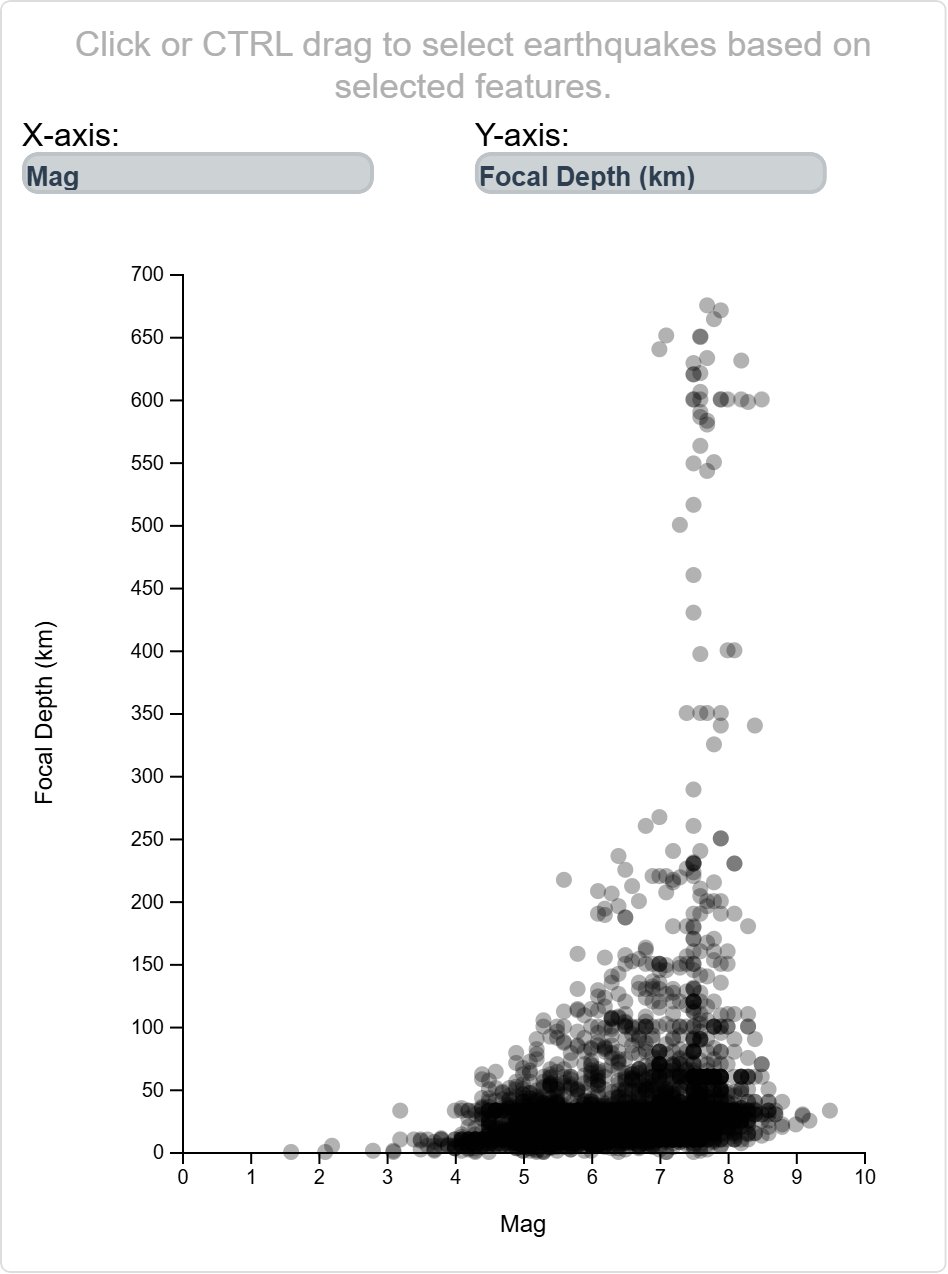
Any two attributes can be plotted against each other. The default, magnitude against focal depth, shows a dense cluster at shallow depths and a separate group of deep-focus earthquakes.
- Axes for skewed impact measures such as deaths or damage switch to a D3 symmetric log scale with ticks at powers of ten once their largest value exceeds 1,000. The symmetric log scale, unlike a plain log scale, is defined at zero, which many impact values are.
- Earthquakes missing either attribute are left out of the plot rather than placed at zero.
- Click and box selection highlight earthquakes on the map and timeline, and the selection persists across axis changes, with a message when the selected earthquakes have no value for the new axes.
Encodings
The encodings follow the distribution of each attribute. Magnitude and intensity map linearly to dot size. Focal depth and impact measures are heavily right-skewed, with a few events orders of magnitude above the rest, so they map logarithmically, both as dot size on the map and as symmetric log axes in the scatterplot. The timeline count follows the same reasoning: with a linear colour scale the sparse historical ranges would be indistinguishable from empty cells next to the dense recent ones. Missing values are treated as missing throughout, by a neutral colour, a default dot size or exclusion from the scatterplot, rather than as zeros that would distort the scales.
Interaction design
Selections use direct manipulation in every view: click for a single event and drag a box for a set, with box selection on Ctrl-drag in the map and scatterplot, so that a plain drag still pans the map. Each selection is applied immediately to the other views, without a separate apply step, so cause and effect stay visible. Feedback is explicit where a selection could otherwise look like a failure, such as an empty timeframe or a selection without values on the current scatterplot axes.
Points of interest and details
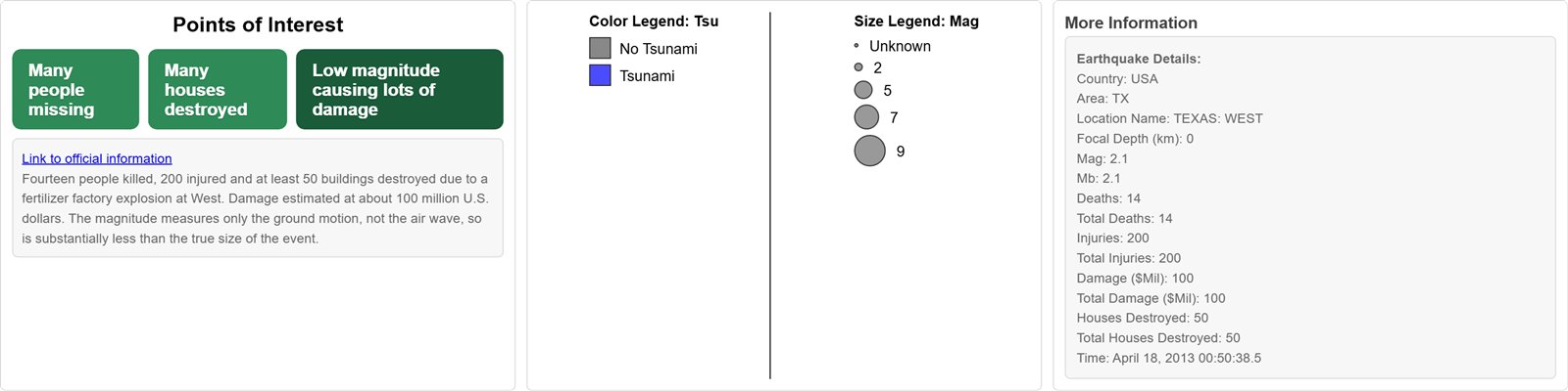
Three preset points of interest guide the user to notable patterns: earthquakes with many people missing, with many houses destroyed, and low-magnitude earthquakes with high damage. Each selects one event across all four views, sets matching scatterplot axes, for example magnitude against damage for the low-magnitude case, and links to official information. The detail panel shows the full record of a selected earthquake: date and time fields are combined into one timestamp, a missing impact figure is replaced by its recorded category where there is one, and the tsunami identifier is used to join the related tsunami records into a second section.
Deployment
The site is built with Vite into a static bundle and deployed to GitHub Pages through continuous deployment, so each update is built and published automatically as a static site, without a server.